This article describes how you can make your 3D recordings responsive when being displayed on web or mobile versions.
If your website is responsive, you can make the 3D showcase responsive, as well, by following the instructions below:
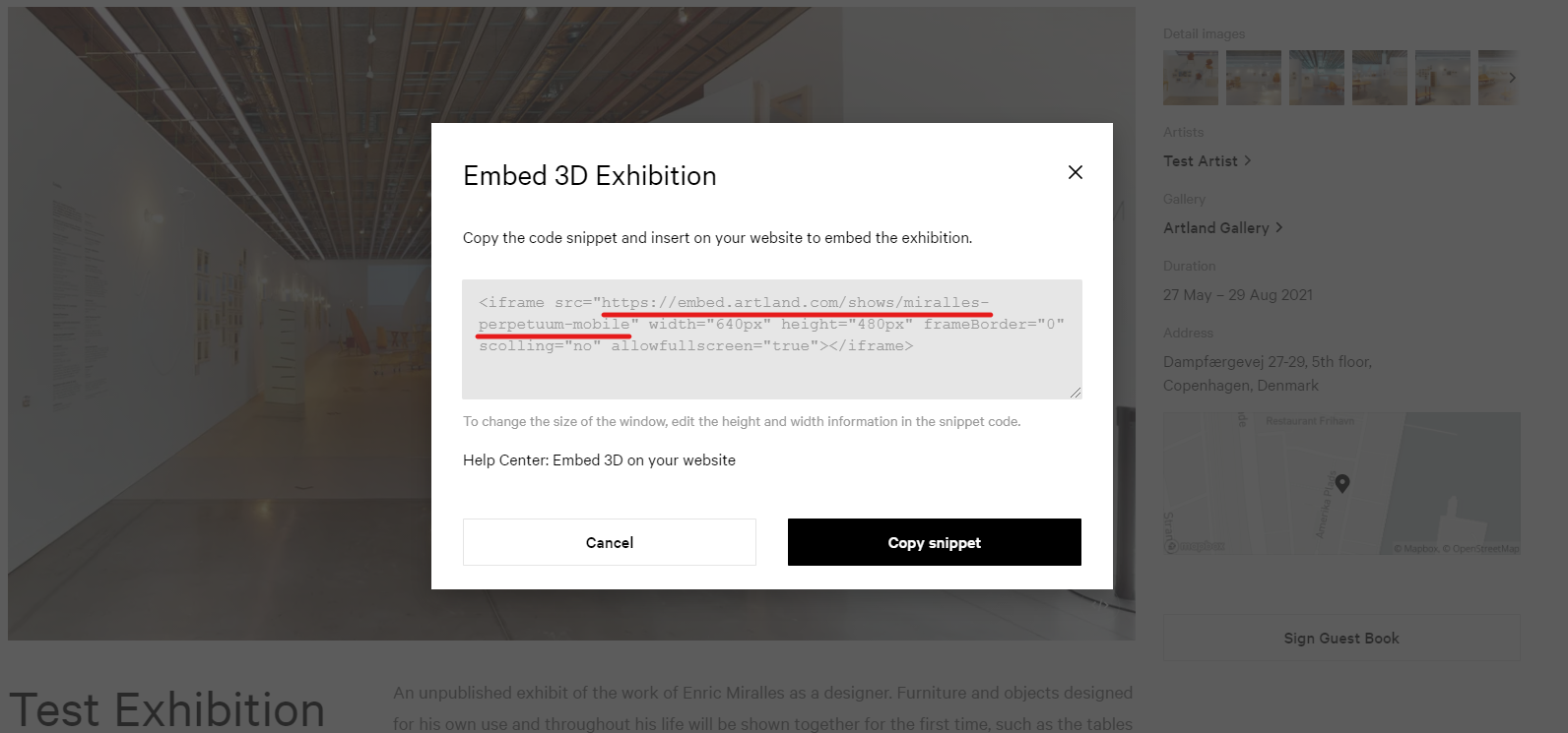
- Find the embedding code of your 3D exhibition and copy theURL as shown in the picture. For more information on how to embed your 3D exhibitions, please read this article.
- Paste the embed code into your HTML code. Add the following code to your HTML body or to an HTML code on your website page - be sure to replace the embed code with the current text in the quotation marks following <div class= (<div class="matterport-showcase"):
<html>
<head>
<style>
.matterport-showcase iframe{ min-height: 240px; margin: 16px 0; width: 100%; }
@media screen and (min-width: 768px) {
.matterport-showcase iframe { min-height: 360px; }} @media screen and (min-width: 992px) { .matterport-showcase iframe { height: 600px; max-width: 1068px; margin: 0 auto 15px; }} .matterport-showcase { text-align: center; }
</style>
</head>
<body>
<div class="matterport-showcase"> <iframe width='853' height='480'
src='https://my.matterport.com/show/?m=9dwWy8VsSw5' frameborder=0 allowfullscreen allow='vr'></iframe>
</div>
</body>
</html>